Variations of date and time visualizations
The ability to use various parts and values of dates and even mix and match them gives you a lot of flexibility in creating unique and useful visualizations.
For example, using the month date part for columns and the year date part for color gives a time series that makes a visual year-over-year comparison quite easy. The year date part has been copied to the label so that the lines can be labeled:

Figure 3.26: The comparison of two years, month by month
This kind of view allows for easy year-over-year comparison.
Clicking on any of the shelves on the Marks card will give you a menu of options. Here, Label has been clicked, and the label was adjusted to show only at the end of each line.
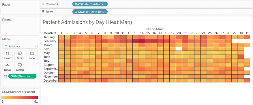
The following heat map is another example of using date parts on different shelves to achieve useful analysis. This kind of visualization can be quite useful when looking at patterns across different parts of time, such as hours in a day or weeks in a month. Here, we are looking at how many patients were admitted by month and day:

Figure 3.27: A heat map showing the intensity of patient visits by day and month
The year has not been included in the view, so this is an analysis of all years in the data and allows us to see whether there are any seasonal patterns or hotspots. We might notice patterns related to epidemics, doctors’ schedules, or the timing of insurance benefits. Perhaps the increased intensity of patient admissions in February corresponds to the flu season.
Observe that placing a continuous field on the Color shelf resulted in Tableau completely filling each intersection of Row and Column with the shade of color that encoded the sum of patient visits. Clicking on the Color shelf gives us some fine-tuning options, including the option to add borders to marks. In this view, a black border has been added to help distinguish each cell.
Last updated