> For the complete documentation index, see [llms.txt](https://nishanthkp.gitbook.io/tableu/llms.txt). Markdown versions of documentation pages are available by appending `.md` to page URLs; this page is available as [Markdown](https://nishanthkp.gitbook.io/tableu/chapter-1/line-charts-exercise-2.md).
# Line Charts Exercise 2
#### Iterations of line charts for deeper analysis
Right now, you are looking at the overall sales over time. Let’s do some analysis at a slightly deeper level:
1. Navigate to the **Sales over time (overlapping lines)** sheet, where you will find a view that is identical to the one you just created.
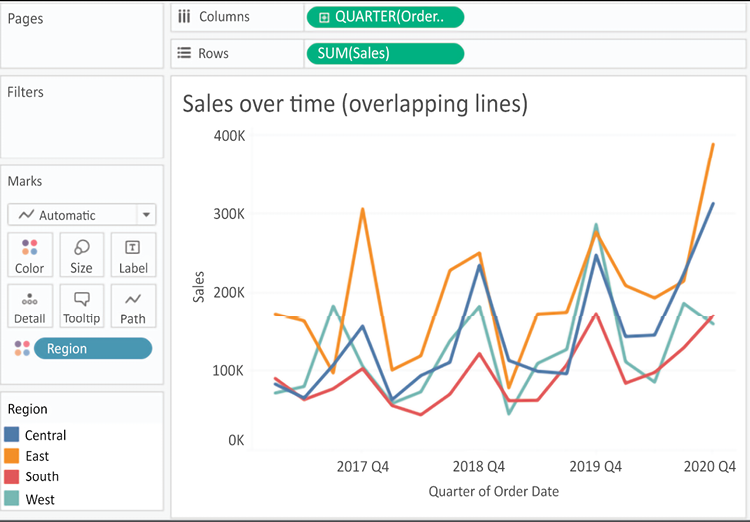
2. Drag the `Region` field from **Dimensions** to **Color**. Now you have a line per region, with each line a different color, and a legend indicating which color is used for which region. As with the bars, adding a dimension to **Color** splits the marks. However, unlike the bars, where the segments were stacked, the lines are not stacked. Instead, the lines are drawn at the exact value for the sum of sales for each region and quarter. This allows easy and accurate comparison. It is interesting to note that the cyclical pattern can be observed for each region:
Figure 1.18: This line chart shows the sum of sales by quarter with different colored lines for each region
With only four regions, it’s relatively easy to keep the lines separate. But what about dimensions that have even more distinct values? Let’s consider that case in the following example:
3\. Navigate to the **Sales over time (multiple rows)** sheet, where you will find a view that is identical to the one you just created.
4\. Drag the `Category` field from **Dimensions** and drop it directly on top of the `Region` field currently on the **Marks** card. This replaces the `Region` field with `Category`. You now have 17 overlapping lines. Often, you’ll want to avoid more than two or three overlapping lines. But you might also consider using color or size to showcase an important line in the context of the others. Also, note that clicking on an item in the **Color** legend will highlight the associated line in the view. Highlighting is an effective way to pick out a single item and compare it to all the others.
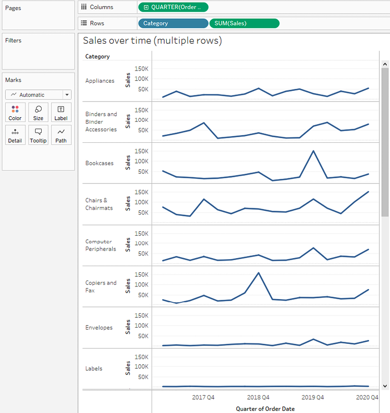
5\. Drag the `Category` field from **Color** on the **Marks** card and drop it into **Rows**. You now have a line chart for each category. Now you have a way of comparing each product over time without an overwhelming overlap, and you can still compare trends and patterns over time. This is the start of a spark-lines visualization that will be developed more fully in *Chapter 10*, *Advanced Visualizations*:
Figure 1.19: Your final view should be a series of line charts for each category
The variations in lines for each `Category` allow you to notice variations in the trends, extremes, and rate of change.