Bar-in-bar chart
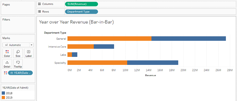
Another possibility for showing relationships between two values for each category is with a bar-in-bar chart. Like the bullet chart, the bar-in-bar chart can show progress toward a goal. It can also be used to compare any two values.
For example, you might compare revenue to a target, or you might compare the revenue for the current year to the previous year:

Figure 3.13: Bar-in-bar chart
To create this view, continue in the same workbook and follow these steps:
Navigate to the Year over Year Revenue (Bar-in-Bar) sheet.
Drag and drop Revenue onto the horizontal axis in the view (which gives the same results as dropping it onto the Columns shelf).
Drag and drop Department Type onto Rows.
Drag and drop Date of Admit onto Color. We’ll discuss dates in more detail in the next section, but you’ll notice that Tableau uses the year of the date to give you a stacked bar chart that looks like this:

Figure 3.14: Interim steps in creating the bar-in-bar chart
For a bar-in-bar chart, we do not want the marks to be stacked. To turn off stacking, use the main menu to select Analysis | Stack Marks | Off.
All the bar segments now begin at
0, and some bars may completely obscure others. To see each bar, we’ll need to adjust another visual element. In this case, hold down the Ctrl key while dragging the YEAR(Date of Admit) field that is currently on Color in the Marks card to Size.Holding the Ctrl key while moving a field from one shelf to another creates a copy of the field instead.
After completing the previous step, a size legend should appear. The bars will be sized based on the year, and we will be able to see all of the segments that are available, even if they overlap.
We want 2019 to be in front and 2018 to be in the background, so drag and drop 2019 within the Size legend to reorder the values so that 2018 comes after 2019:

Figure 3.15: You can drag and drop items in legends to reorder them
Double-click the Color legend to edit the colors so that 2019 is emphasized. A darker orange or blue for 2019 with a light gray for 2018 would serve this purpose well (though you may find other color combinations that you prefer!).
At this point, your view should look like the bar-in-bar chart that was shown in Figure 3.13 at the beginning of this section. You may wish to further enhance the visualization by doing the following:
Adding a border to the bars. Accomplish this by clicking the Color shelf and using the Border option.
Adjusting the size range to reduce the difference between the large and small extremes. Accomplish this by double-clicking the Size legend (or using the caret dropdown and selecting Edit from the menu).
Adjusting the sizing of the view. Accomplish this by hovering over the canvas, just over the bottom border, until the mouse cursor changes to a sizing cursor, and then click and drag to resize the view. You may also want to adjust how the view fills the space. Use the dropdown on the toolbar and experiment with the options:

Figure 3.16: This dropdown determines how the current view is sized
Hiding the size legend. You may decide that the size legend does not add anything to this particular view as size was only used to allow overlapping bars to be seen.
To hide any legend, use the drop-down arrow on the legend and select Hide Card:

Figure 3.17: The Hide Card option for legends
The bar-in-bar chart gives you another way to compare values. Next, we’ll consider a variation that allows us to highlight areas of interest.
Last updated