Highlighting categories of interest
Let’s say one of your primary responsibilities at the hospital is to monitor the number of patient visits to the ICU and Neonatal departments. You don’t necessarily care about the details of other departments, but you do want to keep track of how your two departments compare with others. You might design something like this:

Figure 3.18: A bar chart with two bars highlighted via color
Now, as the data is refreshed over time, you will be able to immediately see how the two departments of interest to you compared to other departments. To create this view, follow these steps:
Navigate to the ICU and Neonatal sheet.
Place Department on Rows and Number of Patient Visits on Columns. Sort the bar chart in descending order.
Click on the bar in the view for ICU, and while holding down the Ctrl key, click the bar for Neonatal.
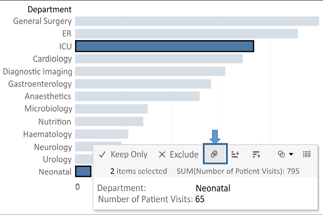
Hover the cursor over one of the selected bars for a few seconds, and from the menu that appears, click the Create Group button (which looks like a paperclip):

Figure 3.19: After Ctrl + clicking the two bars, use the paperclip icon to group them
This will create a group, which results in a new dimension, named Department (group), in the left-hand data pane. Tableau automatically assigns this field to Color.
Ad hoc groups are powerful in Tableau. You can create groups in the view (as you did previously) or by using the menu for a dimension in the data pane and selecting Create | Group. You can use them as you would any other dimension.
To add a label only to the bars for those two departments, right-click each bar and select Mark label | Always show. The label for the mark will always be shown, even if other labels are turned off for the view or the label overlaps marks or other labels.
The color will make monitoring easy. The label will only show for the two departments you selected and will update with the changing data.
Now that we’ve considered how bar charts can be used to compare values and have walked through several examples of variations, let’s turn our attention to visualizing dates and times.
Last updated