# Gantt charts
Gantt charts use the **Gantt mark** type on the **Marks** card dropdown. A Gantt bar mark starts at the value that was specified by the field on **Rows** that defines the axis. The length of the Gantt bar is then determined by the field on the size card, with positive values stretching to the right and negative values to the left.
At the hospital, you might want to see each patient visit to the **ER** in 2019 and understand how long each visit lasted, whether any patients returned to the hospital, and how much time there was between visits. The following steps give an example of how you might create a Gantt chart:
1. Place **Department** on **Filters** and keep only **ER**.
2. Place **Date of Admit** on **Filters**, select **Years** as the option for filtering, and keep only **2019**.
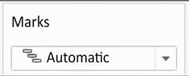
3. Place **Date of Admit** on **Columns** as a continuous **Exact Date** or as a **Day** value (not the **Day** part). Notice that Tableau’s automatic default for the mark type is Gantt bars:
Figure 3.29: In this case, Gantt bars are the automatic mark type
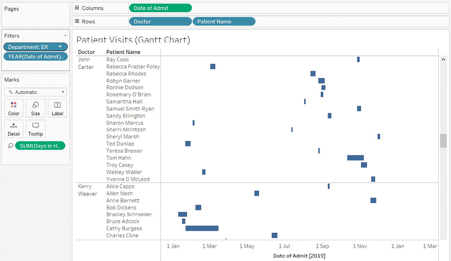
1. Place **Doctor** and **Patient Name** on **Rows**. The result is a row for each patient grouped by each doctor. A Gantt bar represents a stay in the hospital.
In most cases, we’d also want to add a unique identifier to the view, such as `Patient ID`, to ensure that patients who happen to share the same name are distinguished in the visualization. This is not necessary with this dataset, as all names happen to be unique, but it may be vitally important when you work with your data.
2. The length of the Gantt bar is set by placing a field with a duration value on the **Size** shelf. There is no such field in this dataset. However, we have the **Date of Discharge**, and we can create a calculated field for the duration. We’ll cover calculations in more detail in the next chapter. For now, select **Analysis** from the menu and click **Create Calculated Field...**. Name the field **Days in the Hospital** and enter the following code:
```markup
DATEDIFF('day', [Date of Admit], [Date of Discharge])
Copy
```
3. The new calculated field will appear under **Measures** in the data pane. Drag and drop the field onto the **Size** shelf. You now have a Gantt chart showing when patients were admitted and how long each visit lasted.
Consider sorting the **Patient Name** dimension in the view. For example, sorting by field and selecting **Date of Admit** as the minimum would enable you to see patients who were admitted earlier toward the top and patients who were admitted later toward the bottom. It is based on the earliest (minimum) date of admission for the patient, even if they were admitted multiple times. Sorting can be a very useful technique for seeing patterns in the Gantt chart.
Your final view should look something like this:
Figure 3.30: The final Gantt chart, showing each patient, when they were admitted, how long they stayed, and whether they ever returned
This type of chart can be very useful in seeing patterns and relationships between entities over time.