# Symbol Maps Exercise 1
With symbol maps, marks on the map are not drawn as filled regions; rather, marks are shapes or symbols placed at specific geographic locations. The size, color, and shape may also be used to encode additional dimensions and measures.
Continue your analysis of Superstore sales by following these steps:
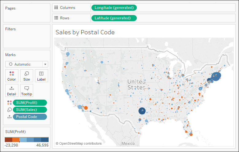
1. Navigate to the **Sales by Postal Code** sheet.
2. Double-click on `Postal Code` under **Dimensions**. Tableau automatically adds `Postal Code` to **Detail** on the **Marks** card and `Longitude (generated)` and `Latitude (generated)` to **Columns** and **Rows**. The mark type is set to a circle by default, and a single circle is drawn for each postal code at the correct latitude and longitude.
3. Drag `Sales` from **Measures** to the **Size** shelf on the **Marks** card. This causes each circle to be sized according to the sum of sales for that postal code.
4. Drag `Profit` from **Measures** to the **Color** shelf on the **Marks** card. This encodes the mark color to correspond to the sum of profit. You can now see the geographic location of profit and sales at the same time. This is useful because you will see some locations with high sales and low profit, which may require some action.
The final view should look like this, after making some fine-tuned adjustments to the size and color:
Figure 1.21: A symbol map showing the sum of profit (encoded with color) and the sum of sales (encoded with size) per postal code
Sometimes, you’ll want to adjust the marks on a symbol map to make them more visible. Some options include the following:
* If the marks are overlapping, click on the **Color** shelf and set the transparency to somewhere between **50%** and **75%**. Additionally, add a dark border. This makes the marks stand out, and you can often better discern any overlapping marks.
* If marks are too small, click on the **Size** shelf and adjust the slider. You may also double-click on the **Size** legend and edit the details of how Tableau assigns size.
* If the marks are too faint, double-click on the **Color** legend and edit the details of how Tableau assigns color. This is especially useful when you are using a continuous field that defines a color gradient.
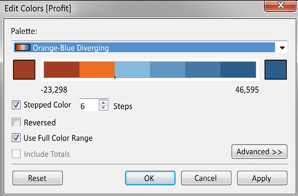
A combination of tweaking the size and using **Stepped Color** and **Use Full Color Range**, as shown here, produced the result for this example:
Figure 1.22: The Edit Colors dialog includes options for changing the number of steps, reversing, using the full color range, including totals, and advanced options for adjusting the range and center point