> For the complete documentation index, see [llms.txt](https://nishanthkp.gitbook.io/tableu/llms.txt). Markdown versions of documentation pages are available by appending `.md` to page URLs; this page is available as [Markdown](https://nishanthkp.gitbook.io/tableu/chapter-1/line-charts-exercise-1.md).
# Line Charts Exercise 1
**Line charts** connect related marks in a visualization to show movement or a relationship between those connected marks. The position of the marks and the lines that connect them are the primary means of communicating the data. Additionally, you can use size and color to communicate additional information.
The most common kind of line chart is a **time series**. A time series shows the movement of values over time. Creating one in Tableau requires only a date and a measure.
## Exercise 1
Continue your analysis of Superstore sales using the `Chapter 01 Starter` workbook you just saved:
1. Navigate to the **Sales over time** sheet.
2. Drag the `Sales` field from **Measures** to **Rows**. This gives you a single, vertical bar representing the sum of all sales in the data source.
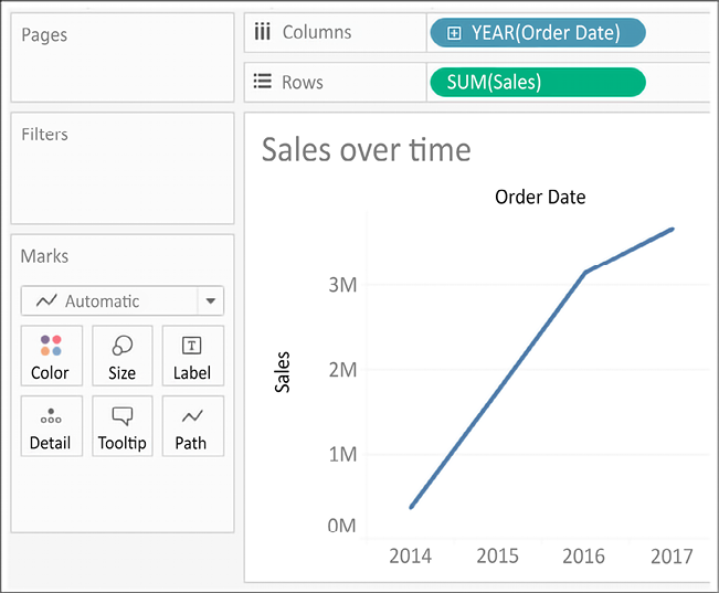
3. To turn this into a time series, you must introduce a date. Drag the `Order Date` field from **Dimensions** in the **Data** pane on the left and drop it into **Columns**. Tableau has a built-in date hierarchy, and the default level of `Year` has given you a line chart connecting four years. Notice that you can clearly see an increase in sales year after year:
Figure 1.15: An interim step in creating the final line chart; this shows the sum of sales by year
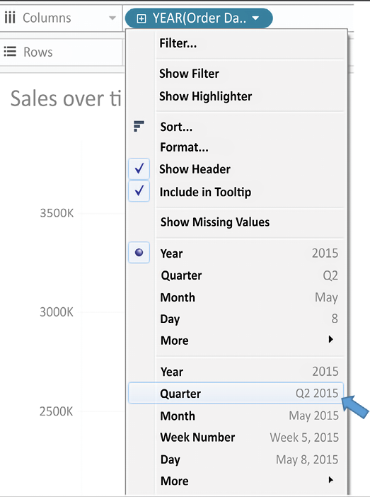
4\. Use the drop-down menu on the **YEAR(Order Date)** field on **Columns** (or right-click on the field) and switch the date field to use **Quarter**. You may notice that **Quarter** is listed twice in the drop-down menu. We’ll explore the various options for date parts, values, and hierarchies in the *Visualizing dates and times* section of *Chapter 3*, *Moving Beyond Basic Visualizations*. For now, select the second option:
Figure 1.16: Select the second Quarter option in the drop-down menu.
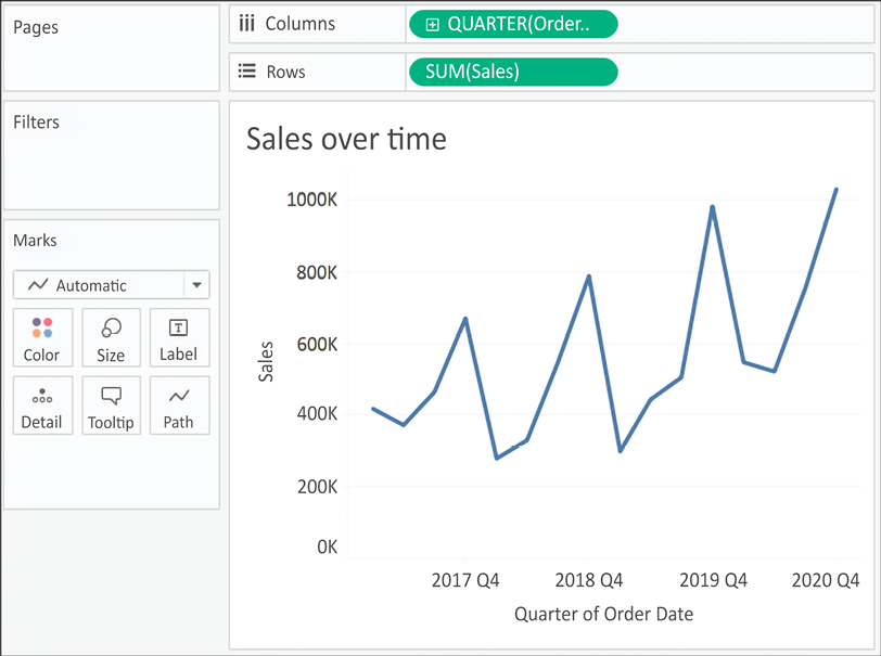
5\. Notice that the cyclical pattern is quite evident when looking at sales by quarter:
Figure 1.17: Your final view shows sales over each quarter for the last several years
Let’s consider some variations of line charts that allow you to ask and answer even deeper questions.